Cara Salyers
  • Artist Statement
  • Blog
  • Portfolio
  • Sketchbook
  • Resume

January 22nd, 2013

1/22/2013

0 Comments

 
http://www.paytonturner.com/
http://flatvernacular.com/

Payton Turner was an artist I heard about when Alessandra Torres came to speak to the class about MICA. She was born in New York, New York and attended MICA as well, graduating with a BFA in 2008. She is currently living in Brooklyn where she has a wallpaper design company called Flat Vernacular. The wallpaper she sells is all comprised of her original designs and have a very fun and wimsical feel and are a combination of fine art and design.
The company specializes in original hand-drawn, printedn, and painted wall papers, and I really like the bright colors and the incorporation of patterns, often made from smaller images. Something really cool and personal about her business is that Payton works individually with clients and customs designs wallpapers in order to bring them exactly what they want. Making art this personal is so exciting to me, and It would be so cool to have my art literally covering the walls in someone's home.
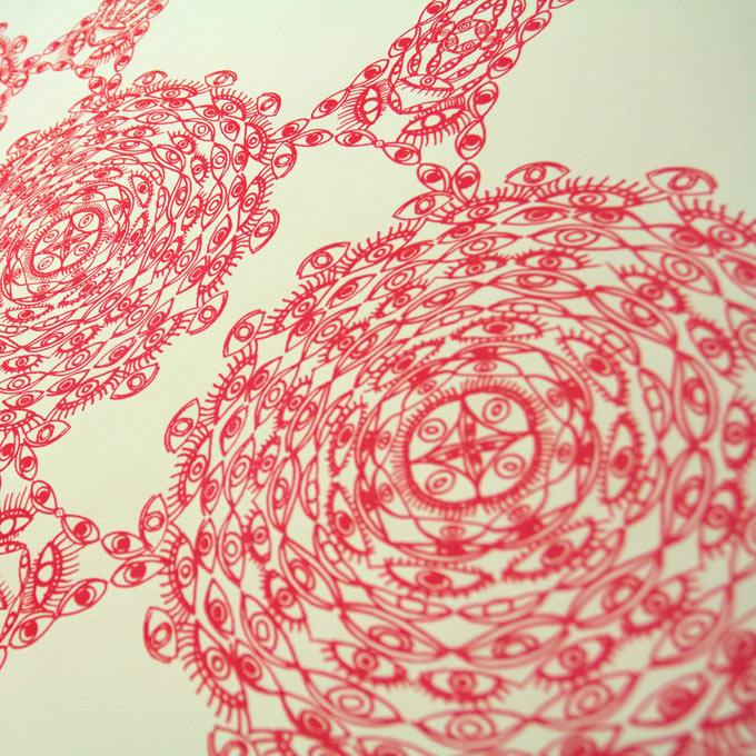
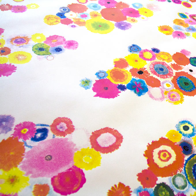
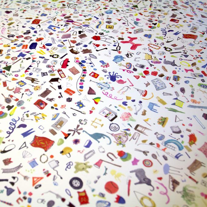
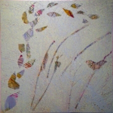
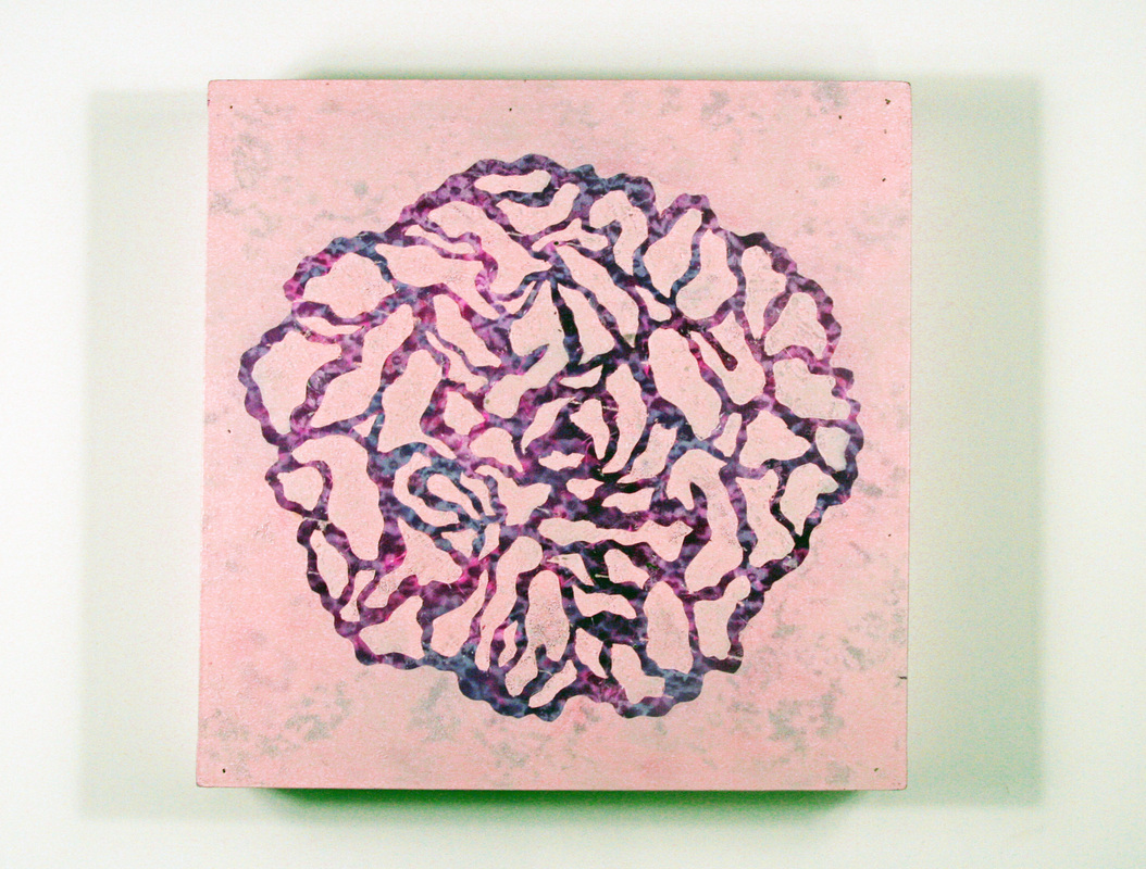
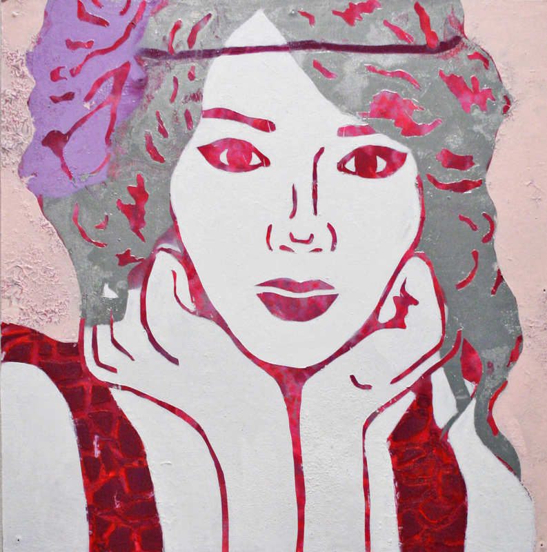
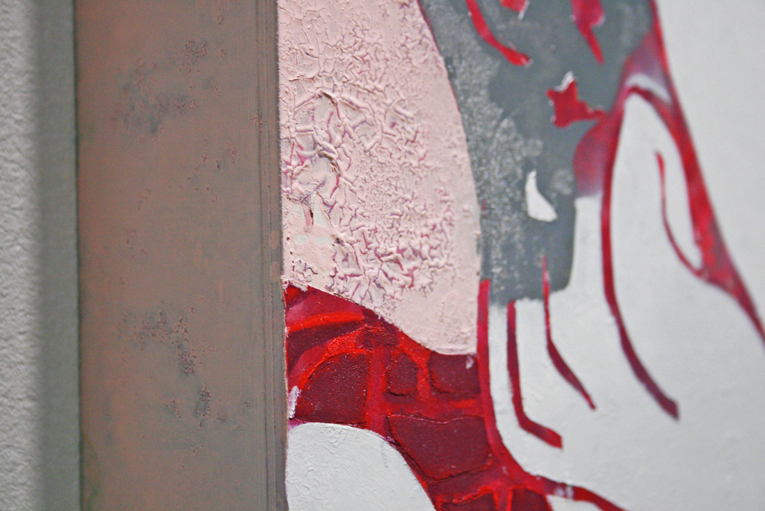
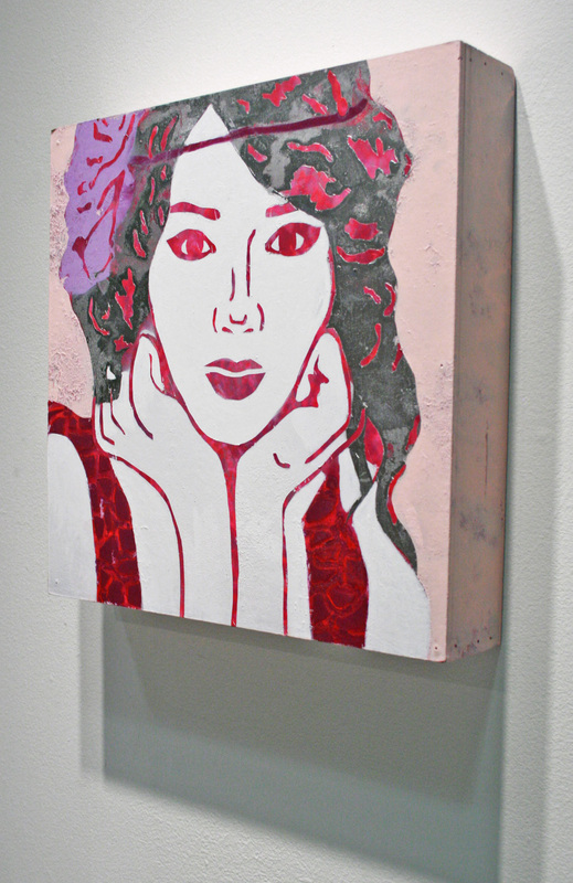
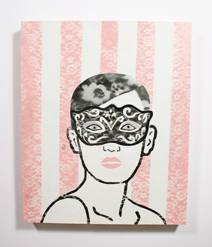
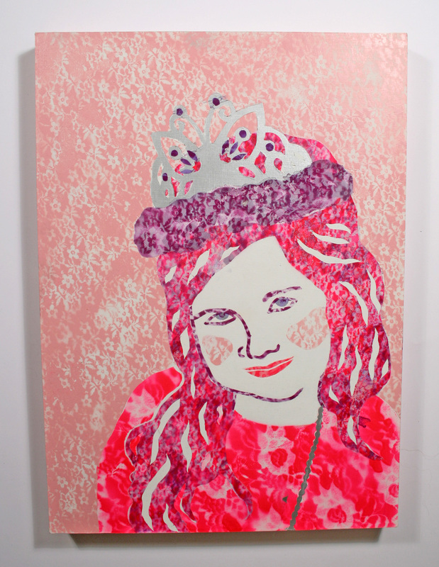
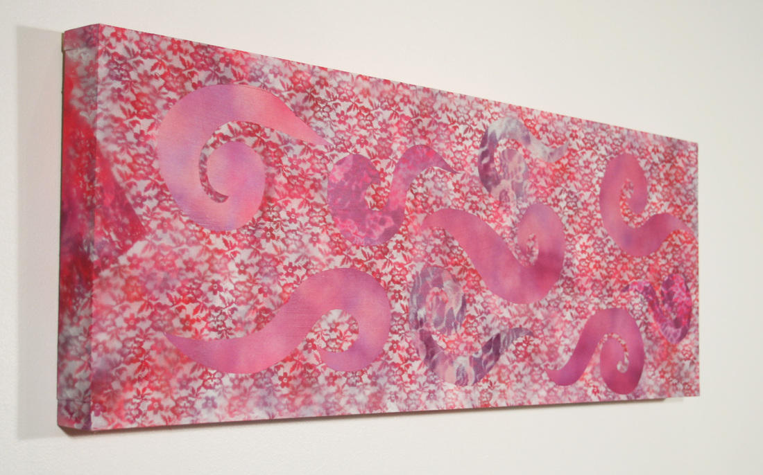
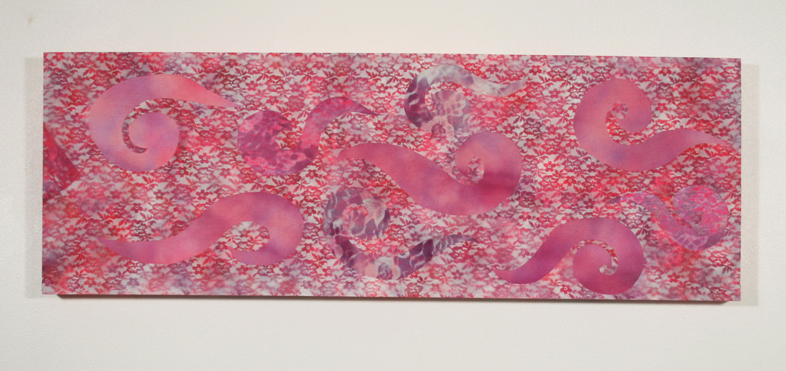
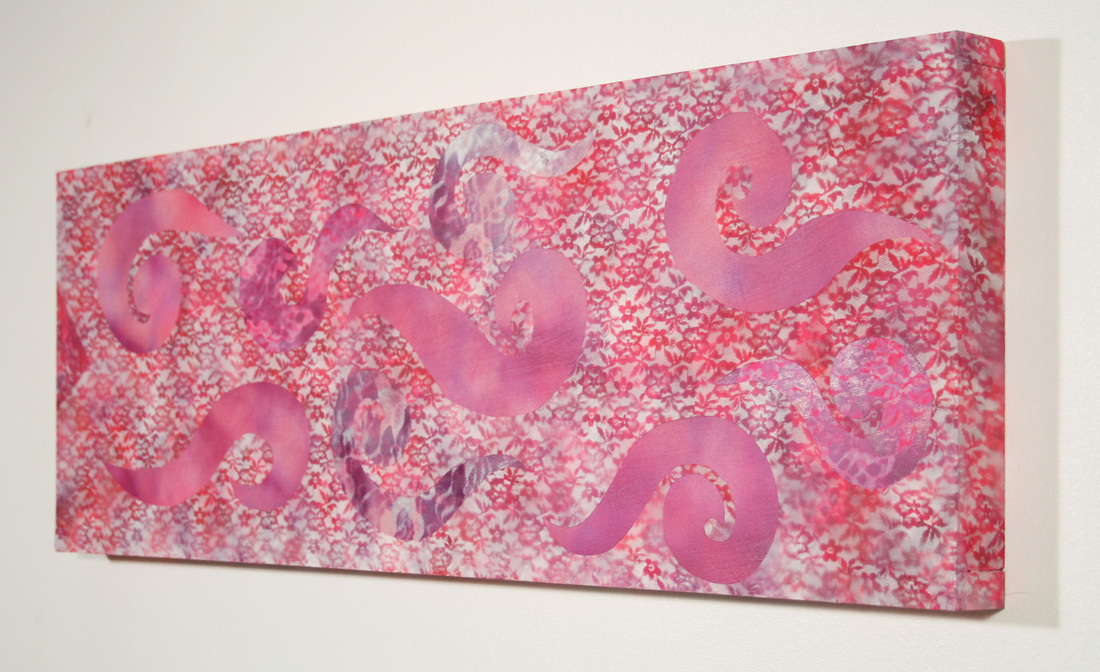
Payton's style is generally feminine and a little quirky, and I feel that it really combines fun and sophisticated well, which is something I attempt to do in my own work. There is a wide variety of pieces that range from simplistic and sophisticated with more muted and soft colors such as her wallpaper called "Beau Monde - Smart Set" to bright and busy pieces that seem chaotic yet organized like in "Flora -Lacquered Garden" and "Too Much Stuff". I really like the incorporation of pattern and design and it definitely has inspired my work for the future. The flowery wallpapers like "Sketchbook Garden - Stylus" in part inspired my most recent piece, and I really found her use of repeated images to create a pattern, like in "Eyelets- Peer" very interesting and something I wanted to explore further in my own work. I feel that her patterns relate to my use of lace and it would be really cool to turn my work into something useful like she did with wallpaper.

0 Comments

Inspiration: Sally Bowring

1/22/2013

0 Comments

 
http://www.sallybowring.com/

One artist I have recently studied is Sally Bowring. She is a modern artist who words with stenciling and and pattern and I found her work very interesting and relatable to the techniques I have recently been studying. A lot of her work is very light and and fun, and I really like her colors and the way she incorporates patterns using reverse stenciling methods.
The process she uses is comprised of many layers in which she combines metallic enamels and acrylic paint, as well as spray solvents that she uses in spray bottles. She creates her images by masking, stenciling, digging, and exposes certain areas to make the work feel very layered and dimensional. It almost makes the images and patterns feel like they are coming from within the painting rather than on top of it. That was very interesting to me and a concept I want to work towards incorporating in my pieces. Most of work is also a square composition, which inspired me to want to work more in square pieces as well because it all relates better and seems more consistent.
Sally's work mimics domestic behavior through the processes she uses to create is and references some important things to her, including concern for order, selection and beauty, cycles, unpredictability, things seen and hidden, and the repitition of life. I like that her work is often metaphorical as well as obvious. In her most recent series there are very obvious references to gardens and the home, but she also works to parallel the pace of painting and and the significant of the home to an individual.
One thing she said that I really related to as an artist was "the paintings are to be experienced and enjoyed, that is all." She feels that paintings don't need an explanation and they are just to be enjoyed by the viewer and interpreted in their own way. That quote really stuck with me because I feel the same way about my work. I just want people to look at it and enjoy it, and I want it to bring them a pleasant feeling.
0 Comments

In Full Bloom

1/22/2013

0 Comments

 
Picture
My most recent work has gone through a lot of changes. I originially tried experimenting with wax to add another element to my art, however, I was very unsatisfied and had a hard time straying away from my typical "pretty" work. I ended up removing the wax and doing a solid stencil like my typical work and I find it much more appealing.

Feed back from my peers on this work and the incorporation of wax was more positive than how I saw it myself. I think it was a positive step forward in experiementing but the execution itself was not what I had hoped. One of the biggest suggestions was to continue to try to incorporate wax, but perhaps different types or colors. I definitely agree and intend to keep experiementing with it my future works.

This piece was sort of a transitional piece for me, moving away from iconic female images to a less literal subject matter and incorporating new media. The flower is in full bloom and in a way represents my personal blooming as an artist and attempting to step out of my comfort zone, even if I wasn't entire successful with that in this piece. It has given me some ideas for my next pieces and is a move in a good direction.
0 Comments

Taylor Swift Portrait

12/11/2012

1 Comment

 
Picture
    This work was a culmination of all my previous works with spray paint and lace put together in a concise and thought-out process. I find the face and background most successful and interesting and am working further with those techniques in my current and future pieces.
1 Comment

Summer Work 2012

11/29/2012

0 Comments


Summer Work Artist Statement

Essentially I wanted to do art that just reflected my personality and the qualities I most possess. That is why I started with pink and just went from there. Pink is my favorite color, but more importantly it expresses the bubbly feminine personality I possess and is the iconic color of femininity. I added the lace aspects to give the soft graceful feel of being womanly and poised. This with the bright colors of pinks and purples gives the strong bubbly side and the soft sweet side of being a girl. By adding the layers of lace and spray paint it is showing the many layers that each individual female possesses. Starting out, my art was all about pink and being girly with the female figures and more juvenile appearance, but now I am going to transition to a more sophisticated feel with the same bright colors and lace but with a more classy and mature feel.

Summer Work Self Evaluation

 9.13.12

Intelligence
Originally my work just started out as making something pink and girly. Through this summer work I wanted to hone my skills and develop a more precise method and more sophisticated idea for my work. I wanted to focus on different aspects of femininity, including the bright, happy innocence, and also the more sophisticated and classic side of being a woman. I use the lace patterns to further push the feminine feel in a subtle way. My work consists of many layers and a variety of colors because there is more to being a girl than what is on the surface and there are multiple layers each a little bit different that make each girl individually herself.
Investment
I went to Lowes to buy all the wood for my panels and had my dad help me cut them so I could make my own panels. I invested a lot of time in making them myself because it actually ends up being less expensive than buying panels, it is just more work. I also spent a lot of time making all of my stencils on photoshop then got them all printed at Kinkos. I also put a lot of time into cutting all the stencils and spraying the multiple layers.  I definitely think I put time and effort into creating these works.
Difficulty
In the beginning my difficulty came mostly from deciding what kind of images I wanted to make in the spray paint style I’ve been developing for myself, but a lot of my challenges with these works came from the actual process of spray painting. A lot of my paints were getting low and the spray paint would drip and cause the stencils to leak and have weird blotches. This made me realize that I need to be more patient and careful and also get new paints that aren’t running low so my work can be of an even better quality.
Self Evaluation
I would give myself and A for this assignment knowing the time I spent planning, photoshopping the stencils, getting all the materials and the time it took me to actually make all three pieces. I think this work is a good improvement and step forward from my previous work and deserves a grade reflective of effort and improvement.
0 Comments

    Cara Salyers

    Senior at Deep Run High School. Student. Cheerleader. Artist.

    RSS Feed

Powered by Create your own unique website with customizable templates.